



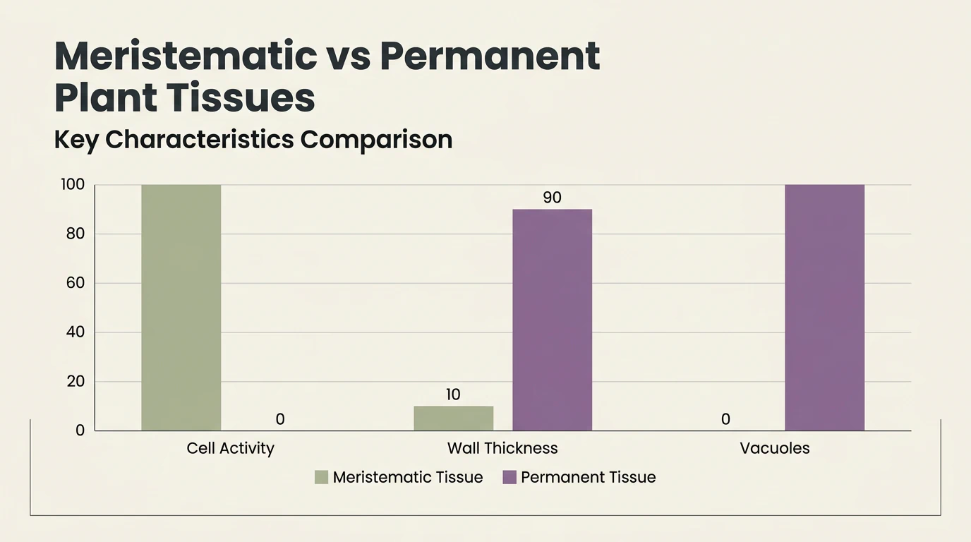
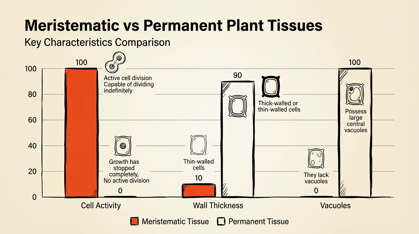
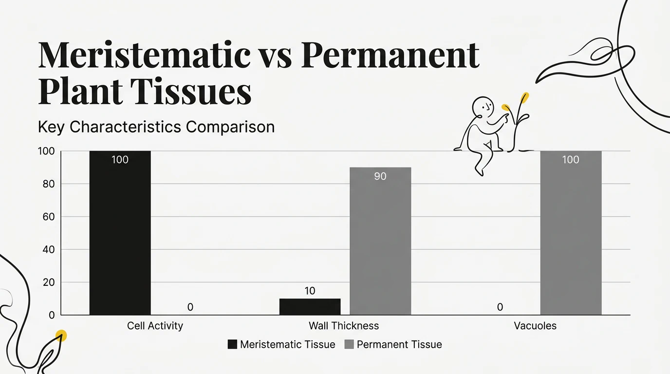
Performance Reviews
Walk category groups live while comparing series.Create Grouped AI Grouped Column Charts
Paste categories and series—MyLens builds a Grouped Column Chart.
Switch unlimited themes when multi-series comparisons need to match your deck.
Loading composer
What to visualize?
Same visual. Endless theme looks.
Switch colors, typography, and layout in one click—pick the style that fits your audience.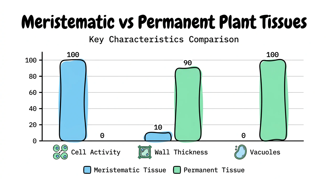
Hear Your Visual Come Alive
One click turns a silent diagram into a guided walkthrough—AI narrates the story while you keep exploring every clickable part.How It Works
Use Grouped Column Charts Anywhere
Reports
Replace multi-column tables with grouped bars readers scan fast.Dashboards
Embed clear grouped columns for recurring metrics.Classrooms
use AI visual actions on series bars while teaching grouped comparisons.Safe and secure
We never use your data to train our AI models, We never share your data with others, Your information always remains yours

Questions & Answers
An AI Grouped Column Chart generator turns text or documents into a clear Grouped Column Chart following a dedicated gallery guide—so structure stays consistent and every part stays easy to scan.
Describe your content or upload a source in the magic box. MyLens locks to the Grouped Column Chart visual, builds a Canvas diagram that follows the guide, and lets you edit it, use AI visual actions, and present it.
MyLens Grouped Column Charts include AI visual actions—not just a flat export. Use Explain, Cite, or Expand on the visual—and unlimited themes let you restyle for each audience.
Paste categories with 2–3 series values each. MyLens groups columns and keeps structure clear.
Yes. Export from MyLens in formats such as PNG, PDF, and PowerPoint for reports and presentations to others.
Yes. MyLens lets you create Grouped Column Charts for free so you can try the full MyLens experience before upgrading.
Yes. Explore more visuals from the Visuals hub, including Sankey Flow, Timeline, Mind Map, and more.