MyLens Visuals
Interactive AI visuals for flows, maps, timelines, and more—pick a format and turn your sources into a clear diagram.
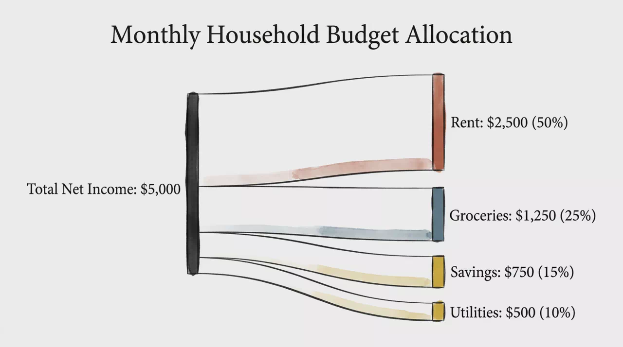
Sankey Flow
Directional flow diagrams where path width shows how a total splits, filters, or transforms left to right.
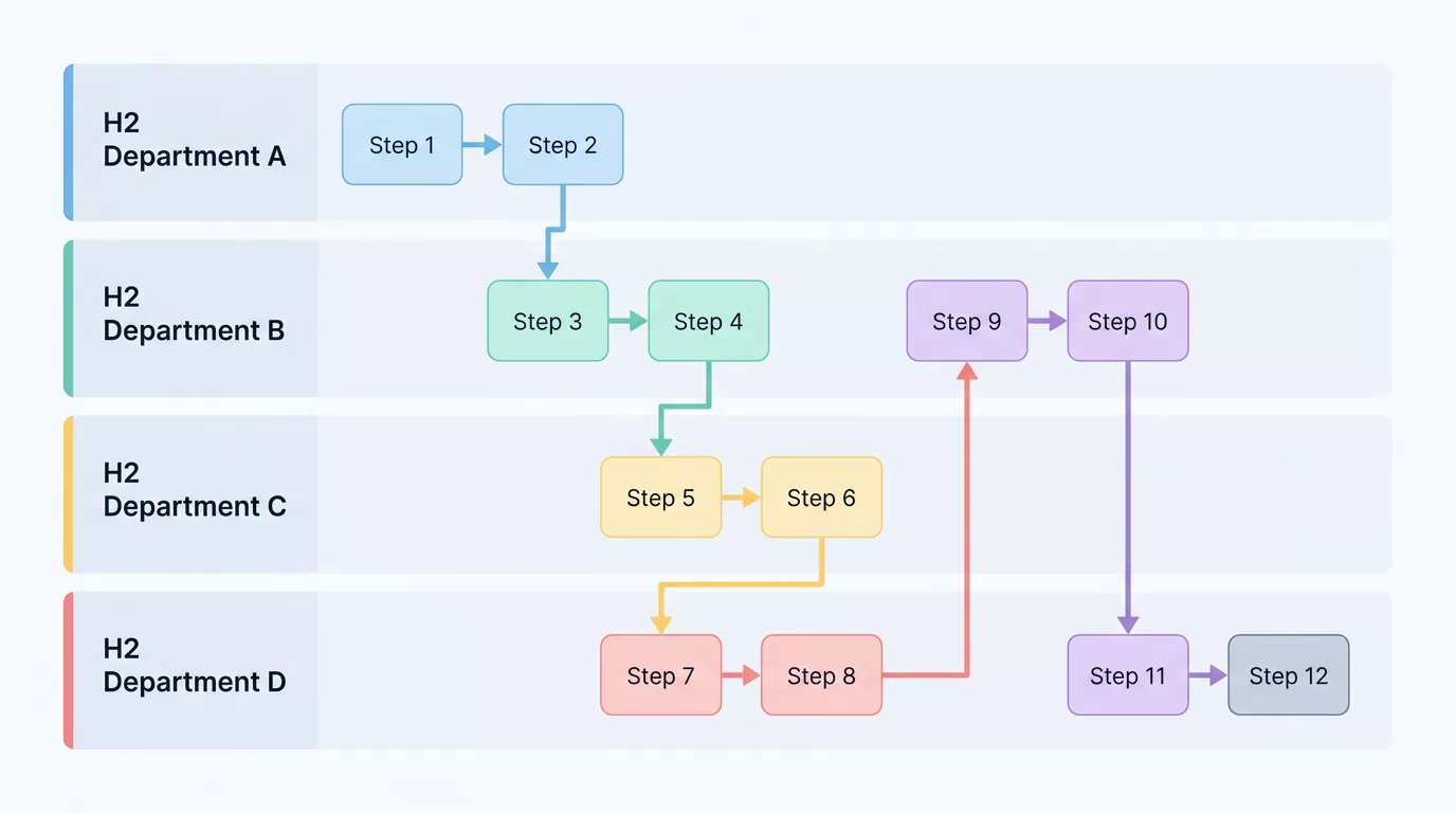
Swimlane Process Map
Process steps in role or department lanes, showing sequence and hand-offs across teams.
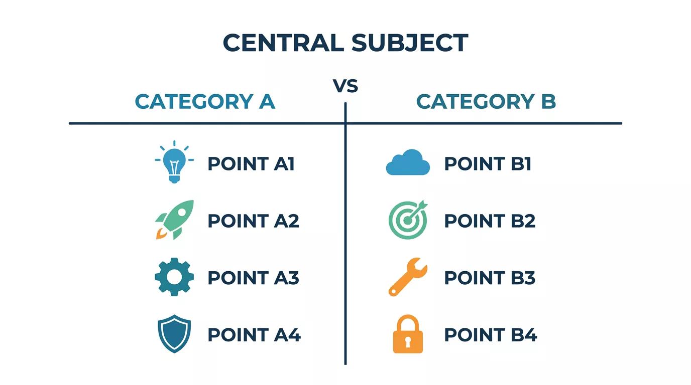
Opposing T-Chart
T-shaped comparison of two opposing categories with balanced points on each side.
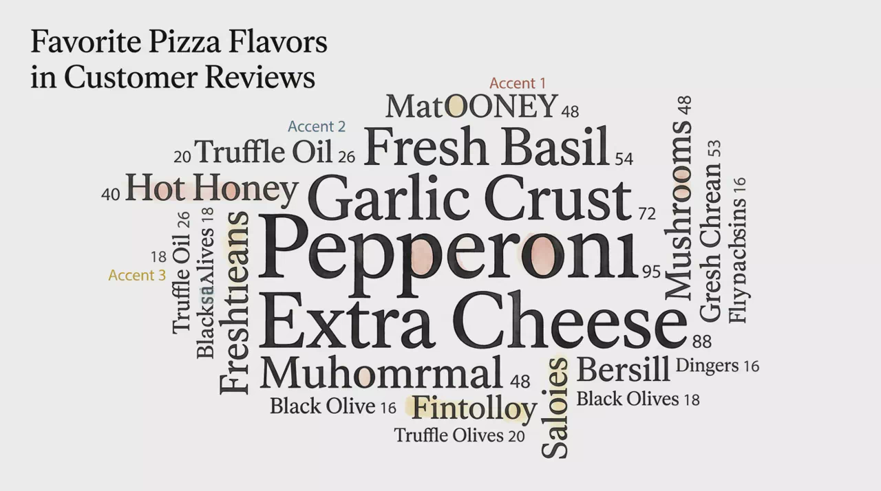
Word Cloud
Organic keyword cluster where word size reflects weight, frequency, or importance.
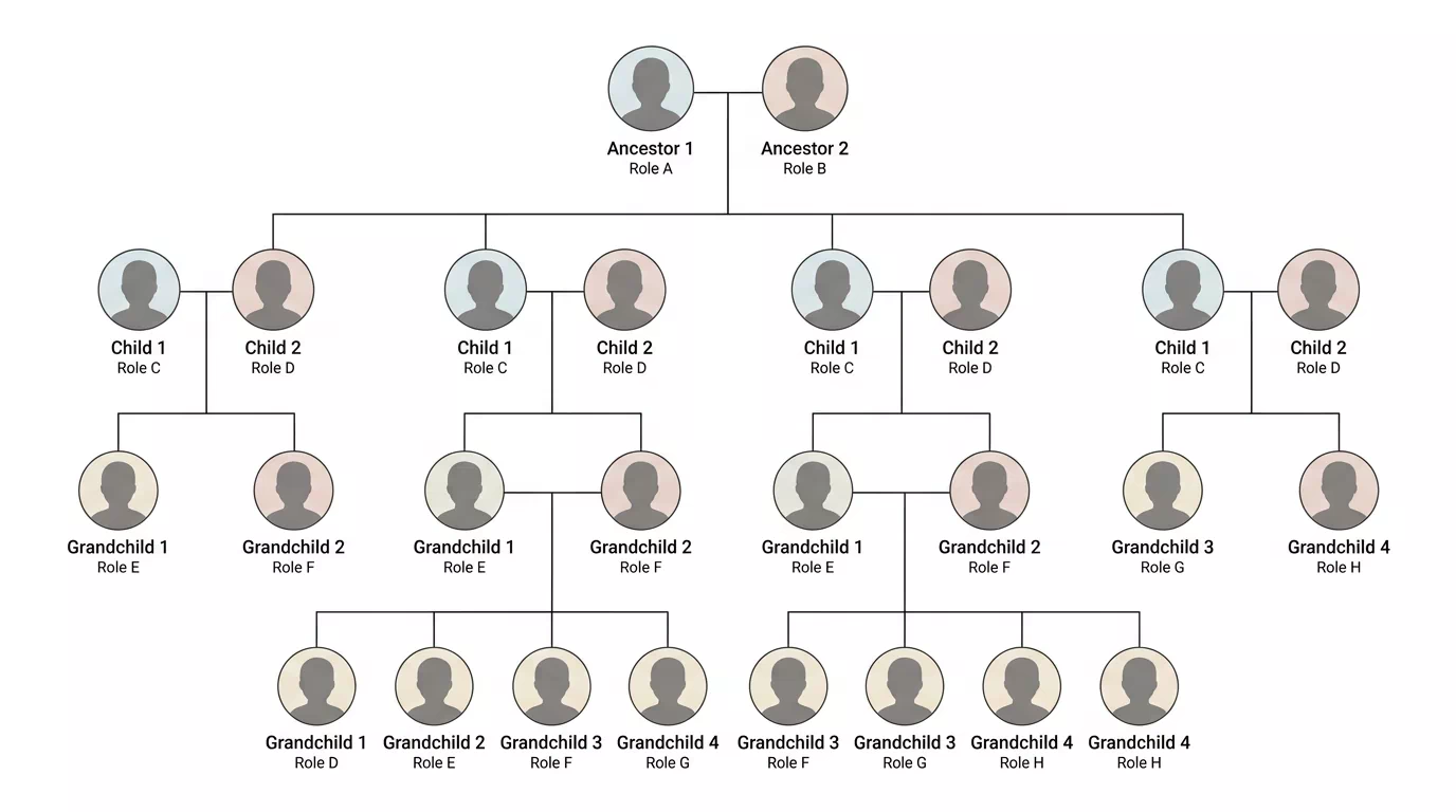
Family Tree
Generational branching tree of individuals, unions, and descent across lineage rows.
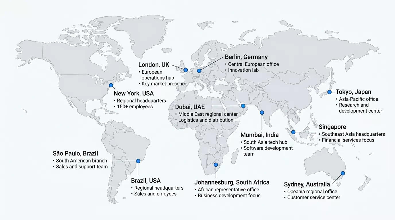
Geographic Point Map
Plot cities, offices, or regions as points on a simplified world map.
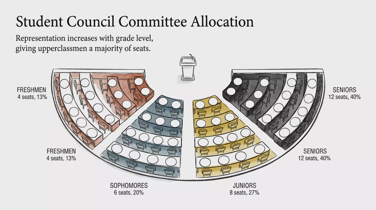
Hemicycle Seating
Show party or group weight in a semi-circular seating arc.
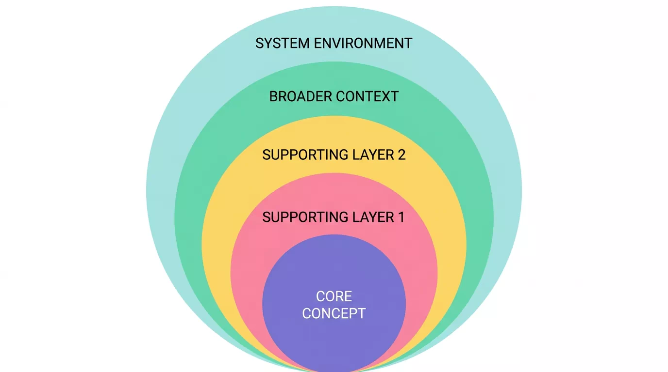
Nested Onion
Nested layers from a core outward to show containment or hierarchy.
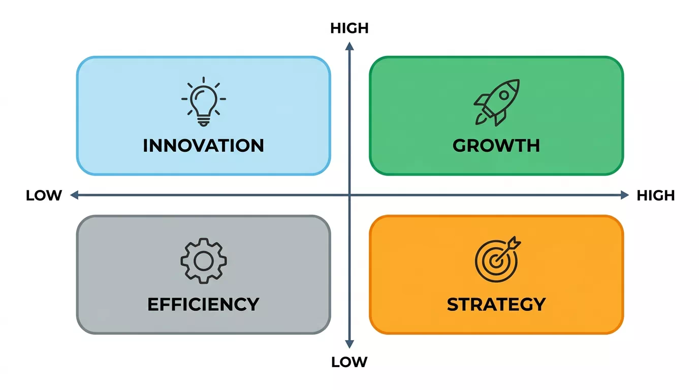
Strategic Quadrant Matrix
Four-quadrant grid on two axes for categorizing options or priorities.
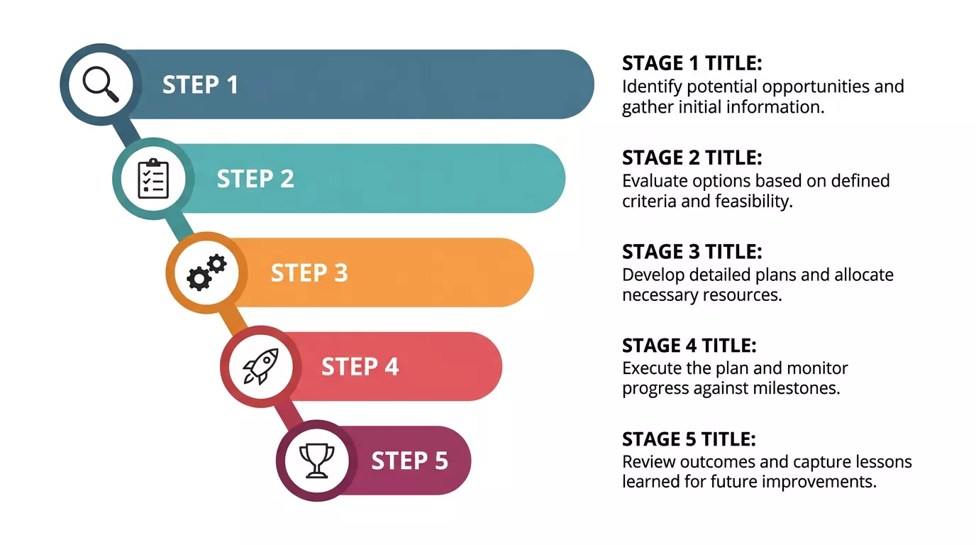
Stepped Horizontal Funnel
Staggered horizontal stages that narrow like a stepped funnel journey.
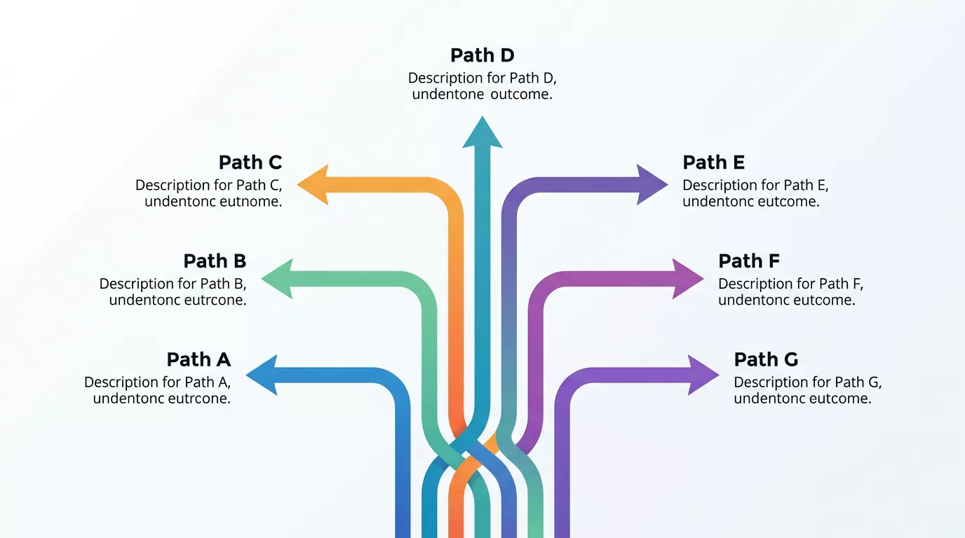
Diverging Path Tree
Parallel paths rising from a shared base, peeling toward distinct outcomes.
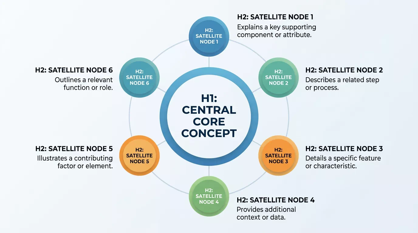
Orbital Hub
Central core with satellite nodes in orbit for related components.
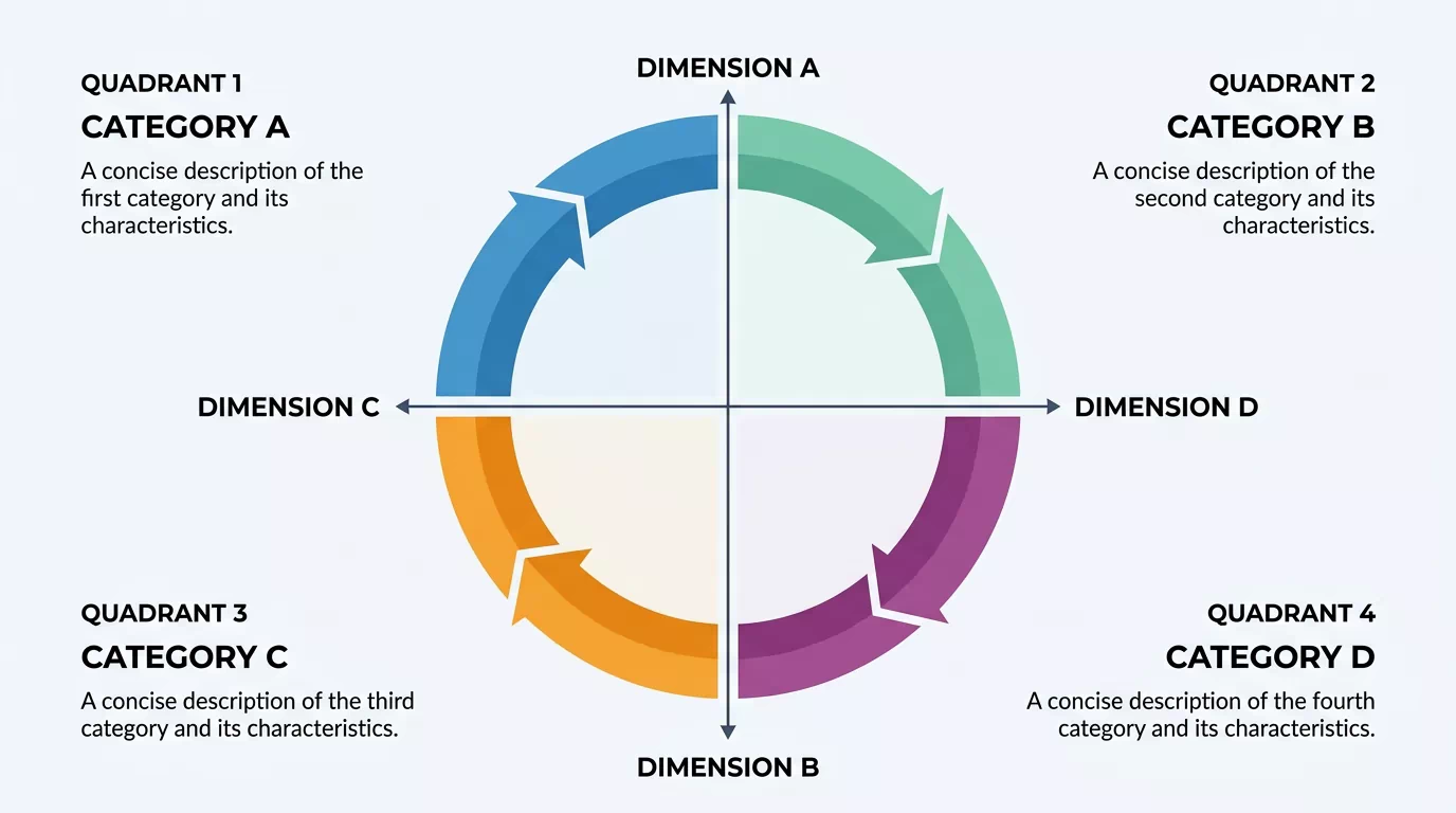
Circular Quadrant Matrix
Circular four-segment matrix balancing categories across two axes.
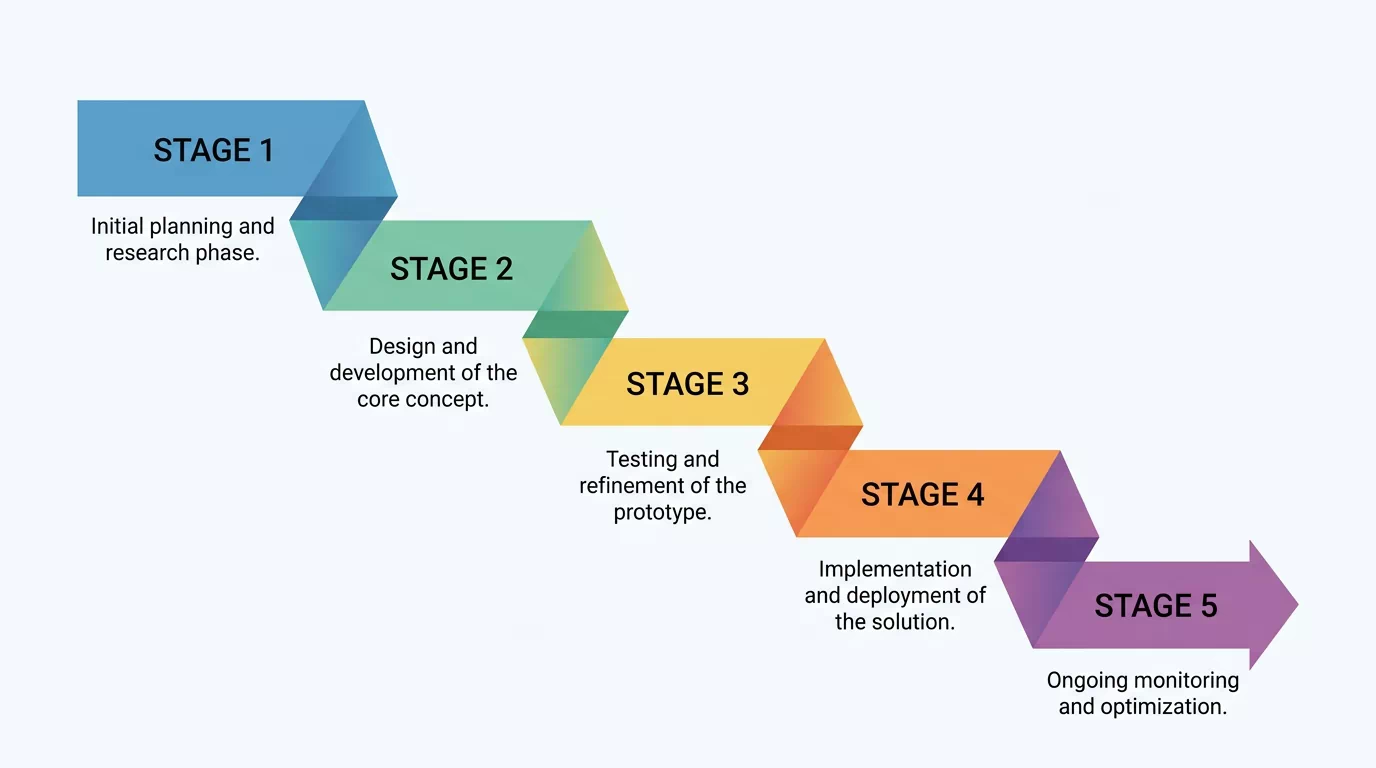
Folded Ribbon Process
Linear stages as a continuous folded ribbon descending diagonally through a process.
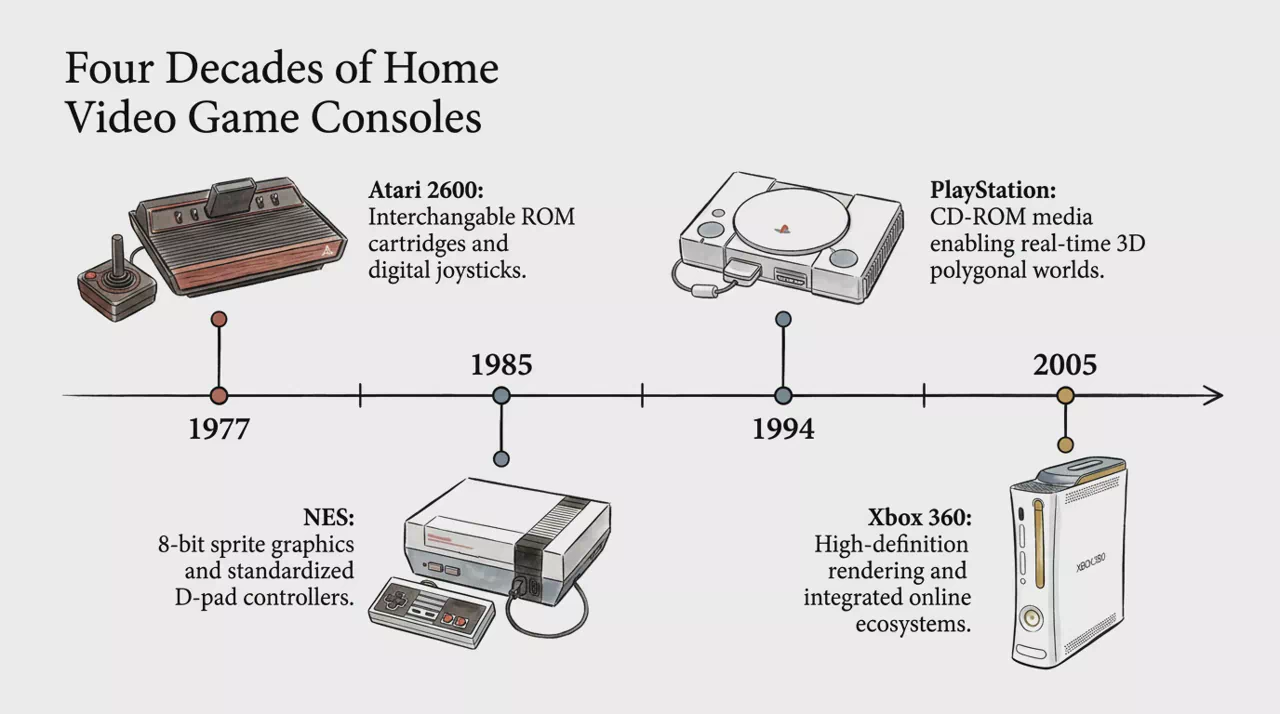
Timeline
Sequence events and milestones into a clear, interactive timeline.
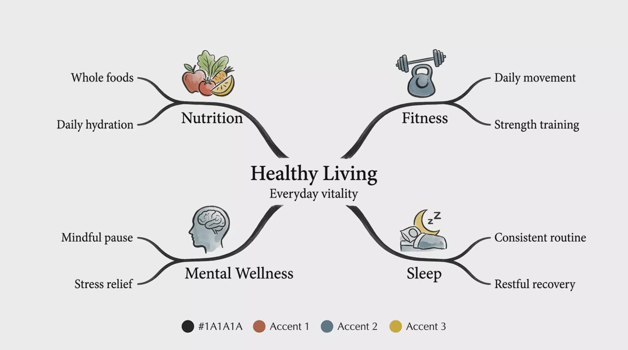
Mind Map
Group and connect ideas into an interactive mind map you can expand and explore.
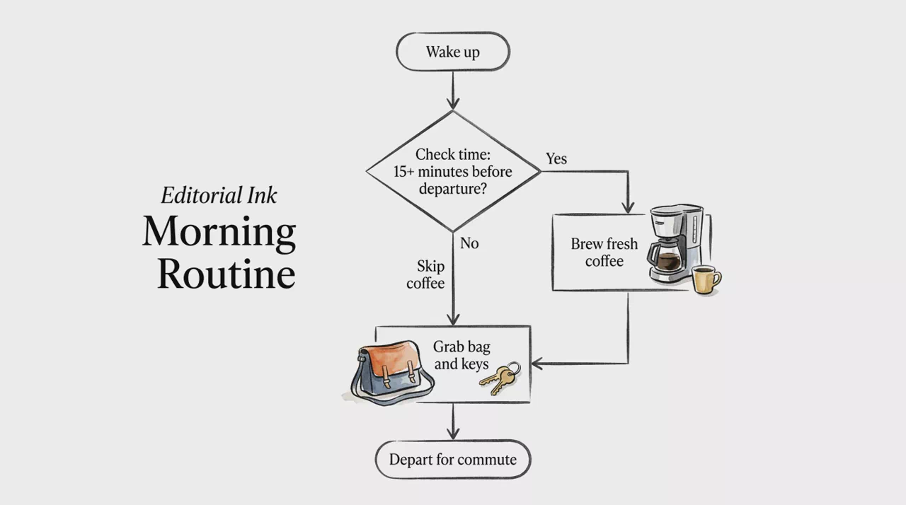
Flowchart
Map processes and logic with clickable flowchart nodes.
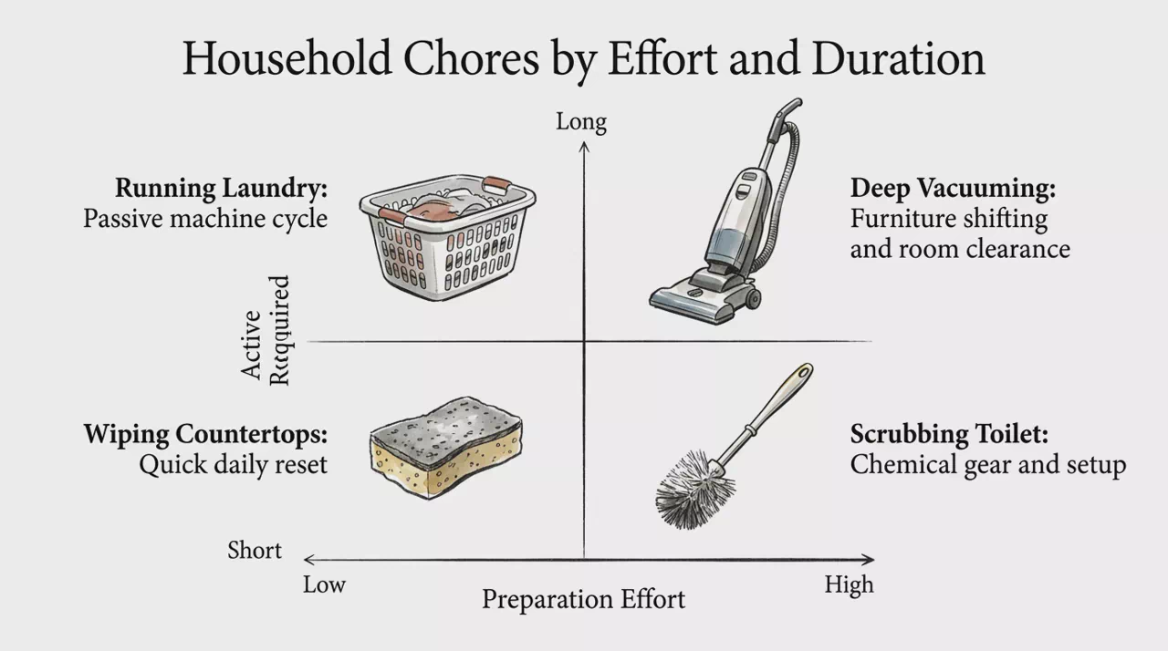
Quadrant
Compare options on two axes for prioritization and analysis.
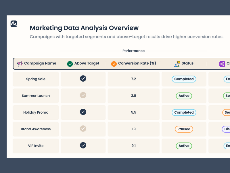
Table
Organize structured information into clear, interactive tables.
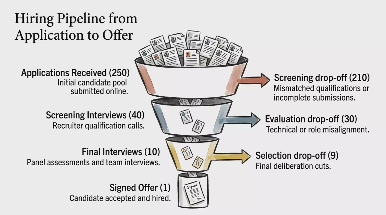
Funnel
Visualize stages and drop-offs across journeys and pipelines.
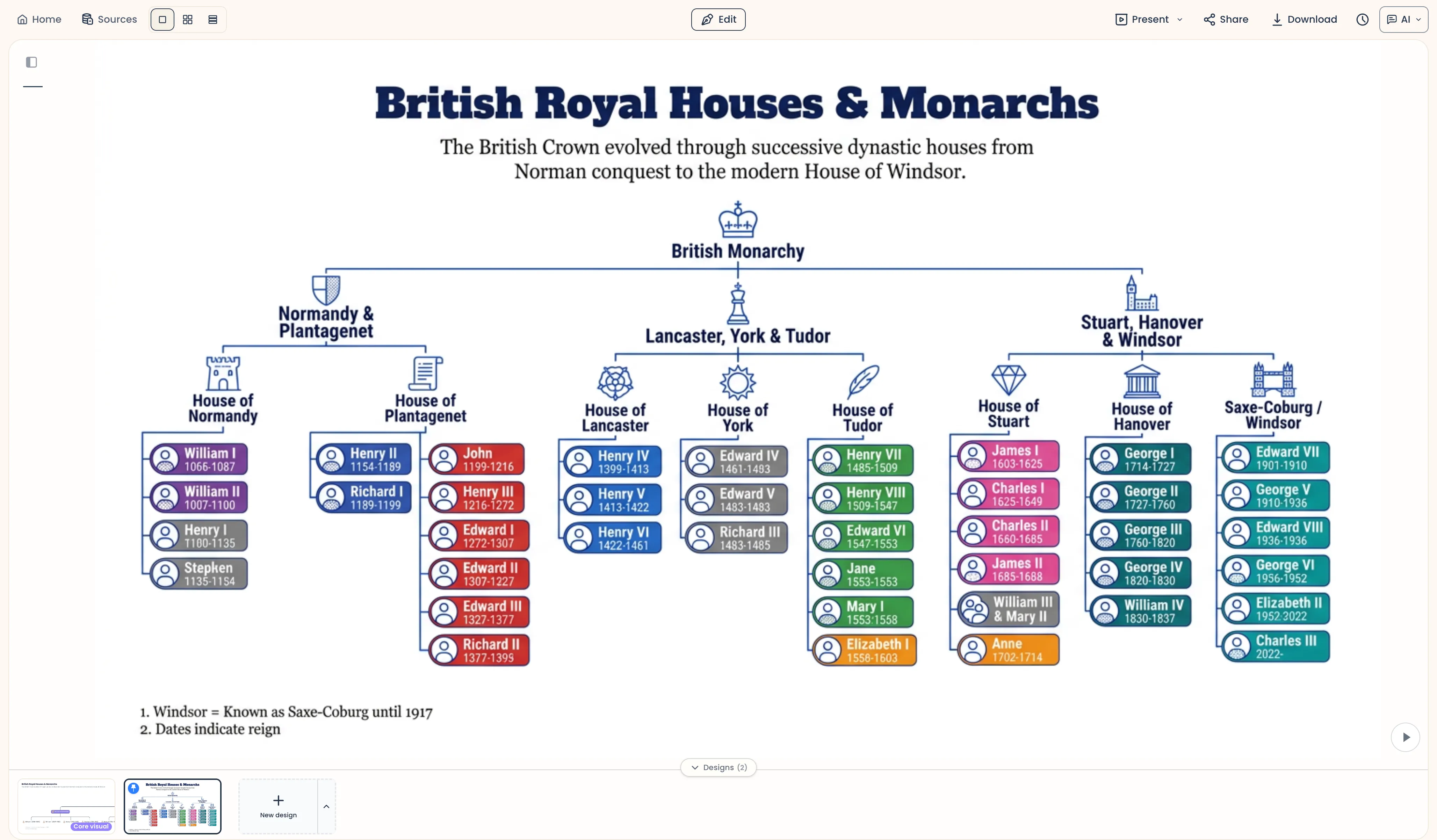
Tree
Show hierarchy and branches from a root concept outward.
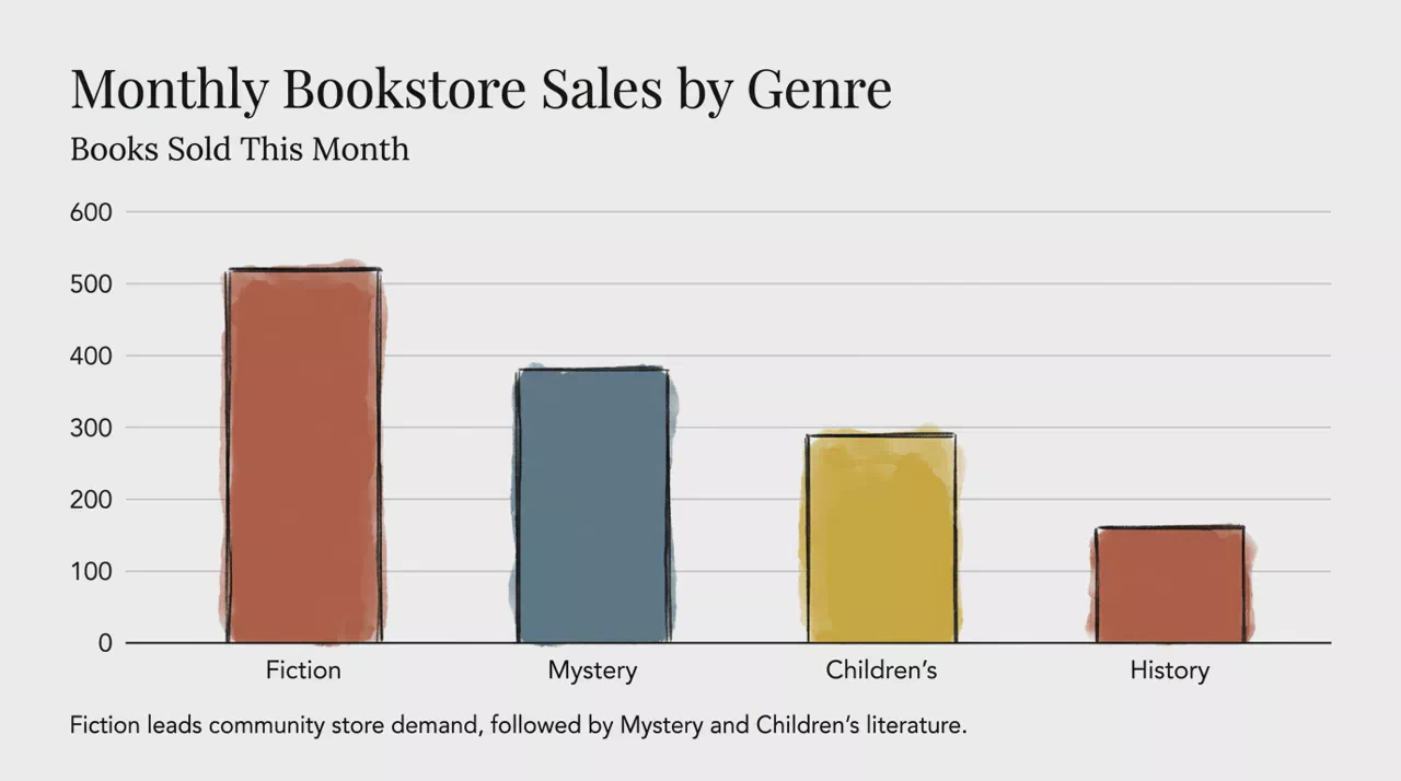
Vertical Bar Chart
Compare categories with proportional vertical bars on a shared scale.
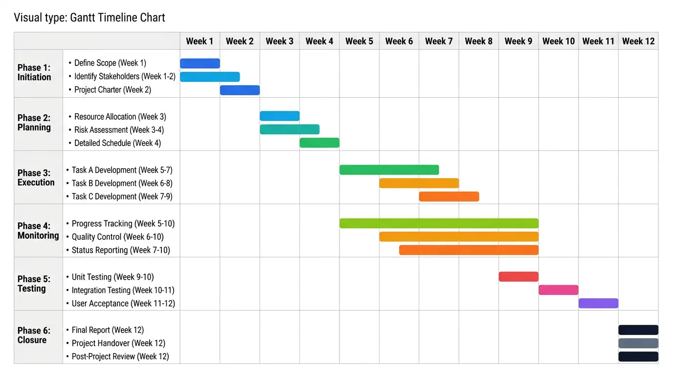
Gantt Timeline Chart
Plan projects with phased tasks and duration bars on a shared time axis.
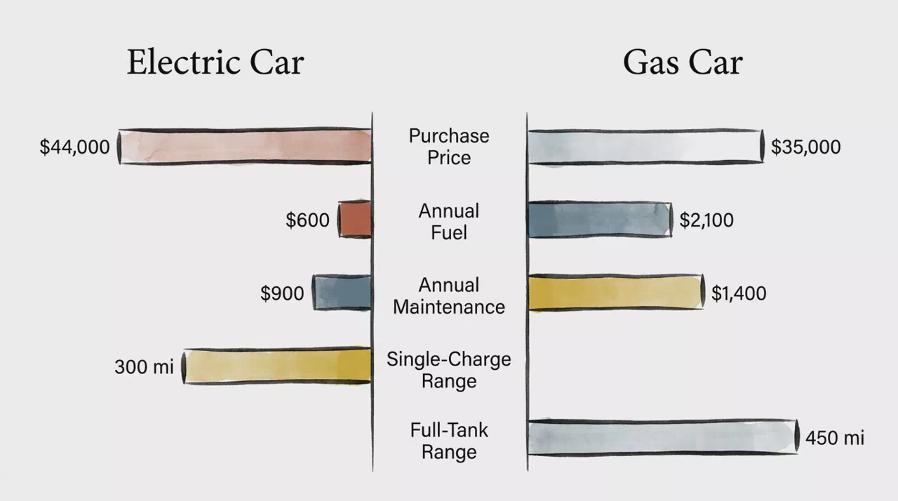
Comparison Bar Table
Compare two entities across shared metrics with mirrored horizontal bars.
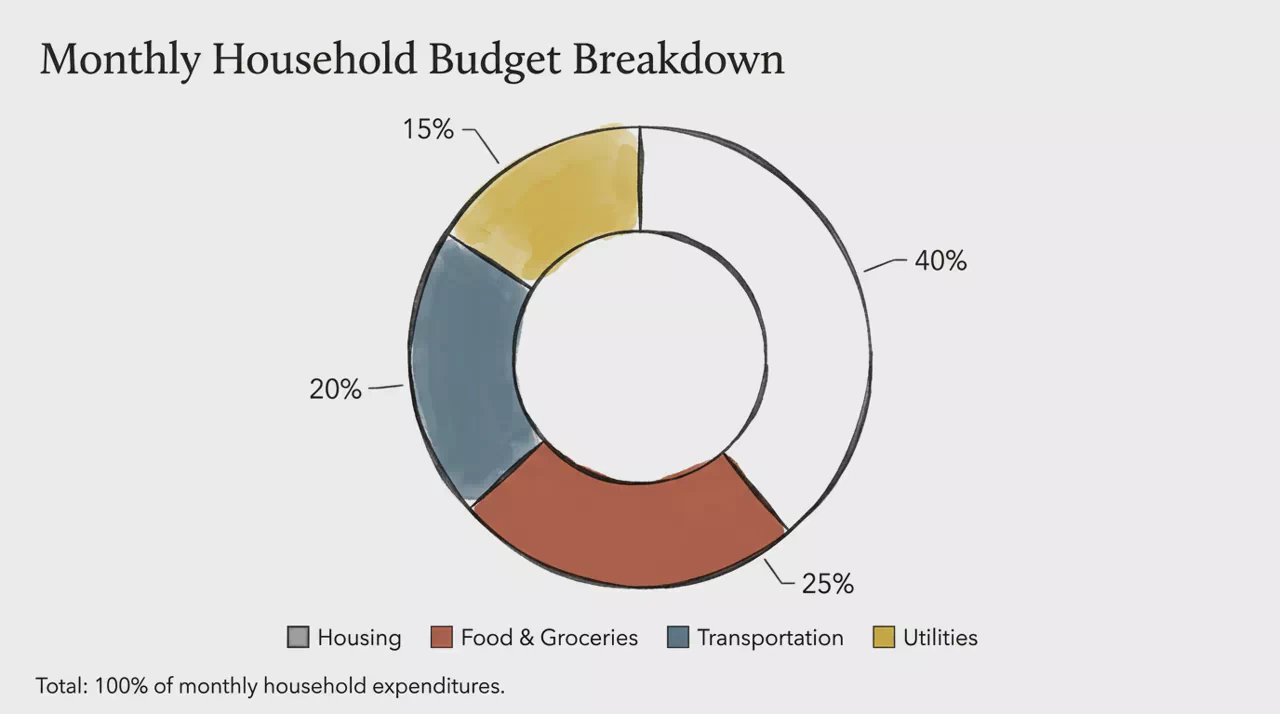
Donut Ring Chart
Show part-to-whole mix with a hollow ring segmented by share.
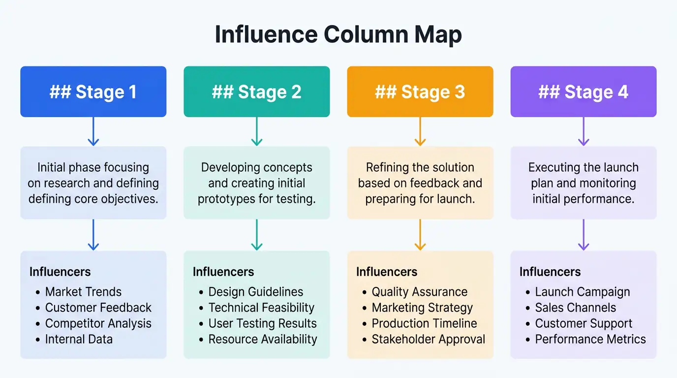
Influence Column Map
Map stages in columns with the channels and forces that shape each one.
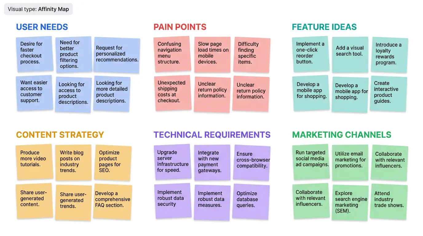
Affinity Map
Cluster ideas and observations into theme groups for synthesis.
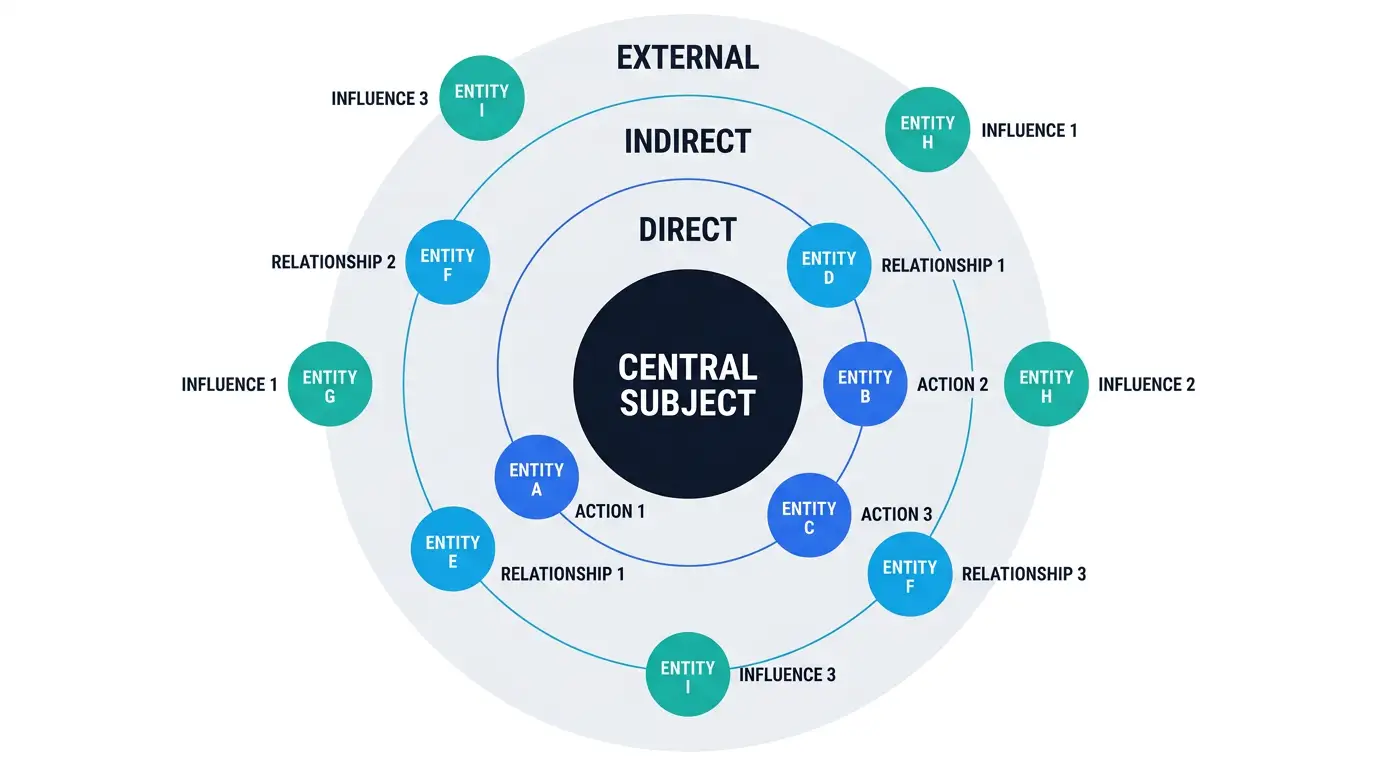
Concentric Ecosystem Map
Place stakeholders in rings by proximity to a central subject.
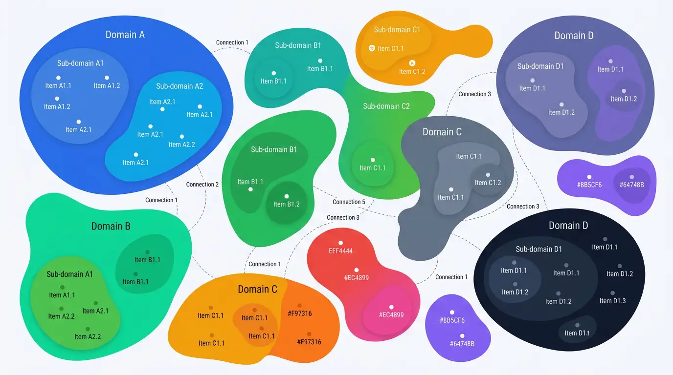
Organic Landscape Map
Show related domains as nested organic shapes with connections.
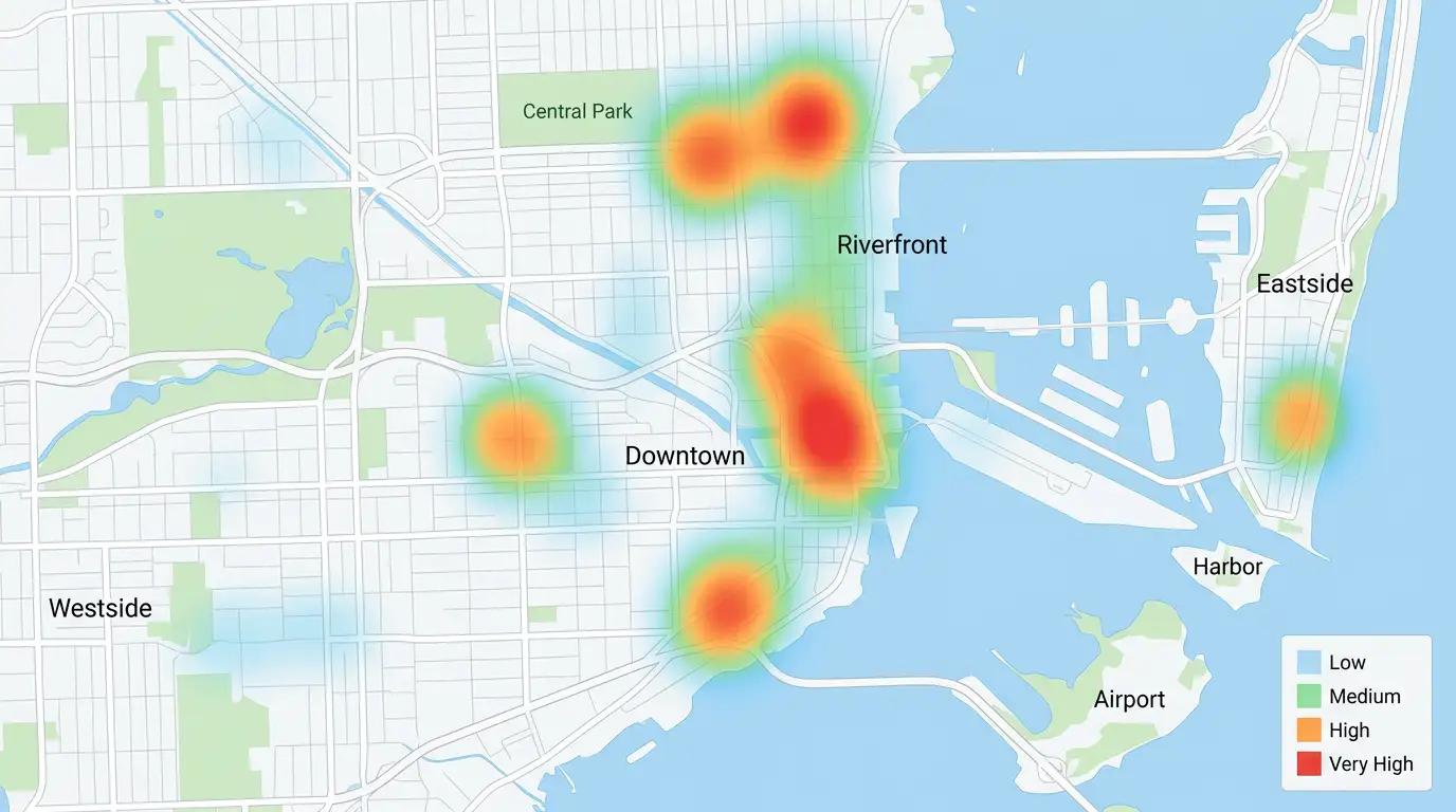
Geospatial Heat Map
Overlay intensity on a map to show density or magnitude by place.
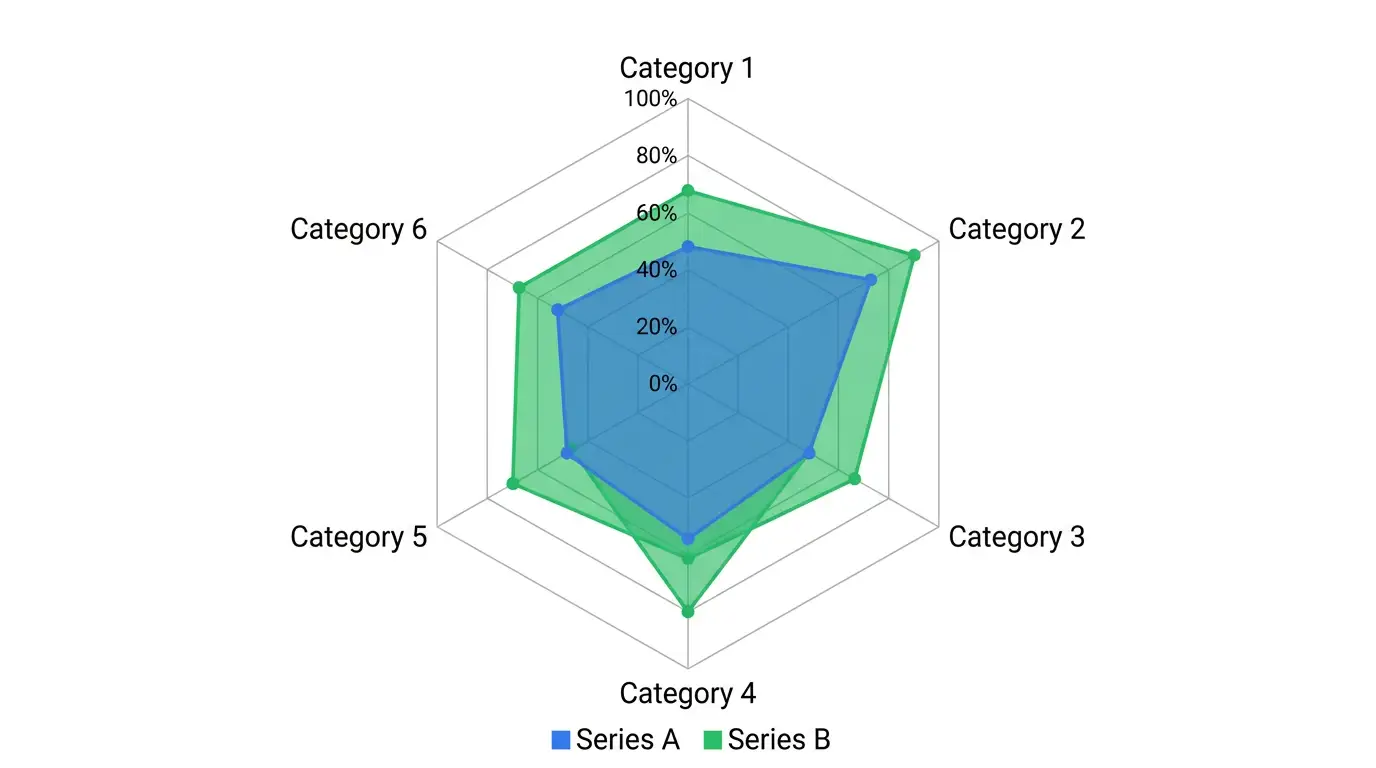
Spider Radar Map
Compare profiles across shared metrics on a radial spider chart.
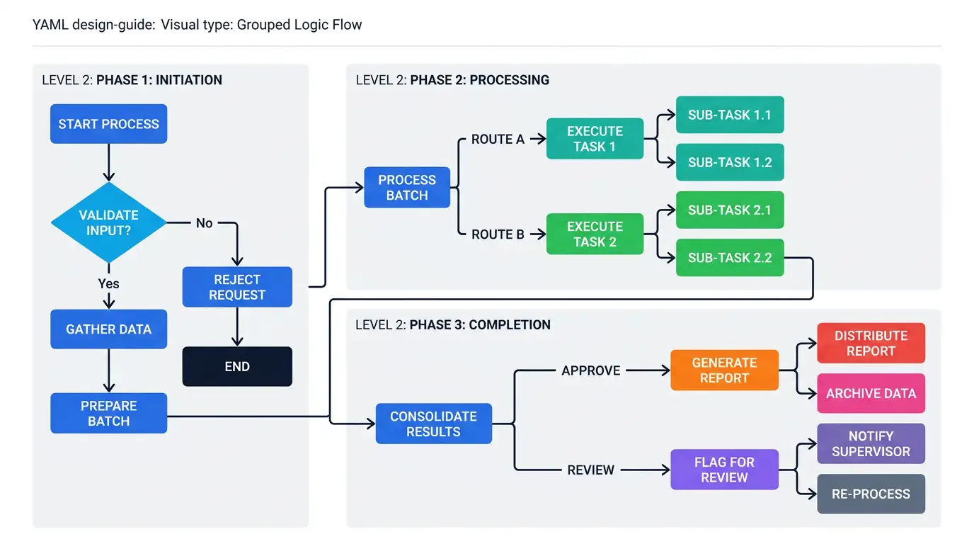
Grouped Logic Flow
Organize processes into containers with steps, branches, and decisions.
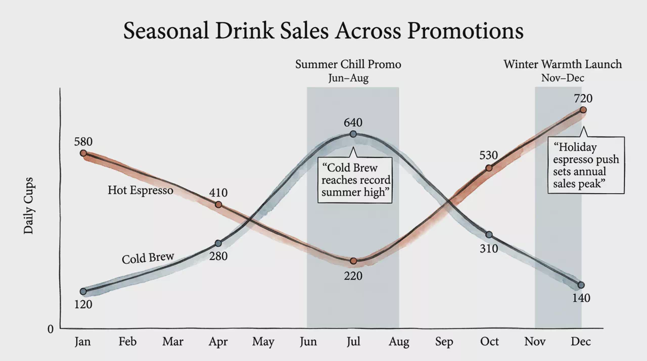
Annotated Multi-Line Chart
Track multiple series over time with era bands and event callouts.
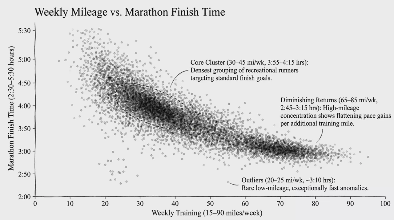
Density Scatter Plot
Reveal clusters and outliers across two numeric variables with dense points.
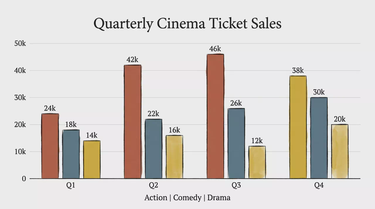
Grouped Column Chart
Compare multiple series side-by-side within each category group.
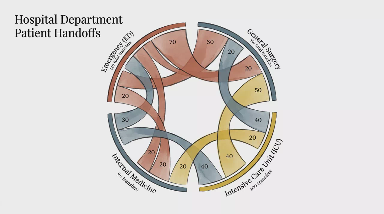
Circular Chord Network
Circular arcs and ribbons showing connection volume between entities.
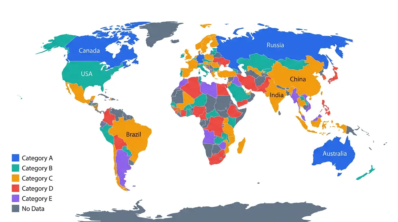
World Choropleth Map
Shaded world regions showing how a variable or category varies globally.
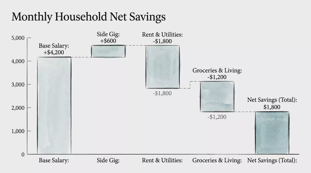
Waterfall Bar Chart
Sequential bars showing how gains and losses build from start to total.
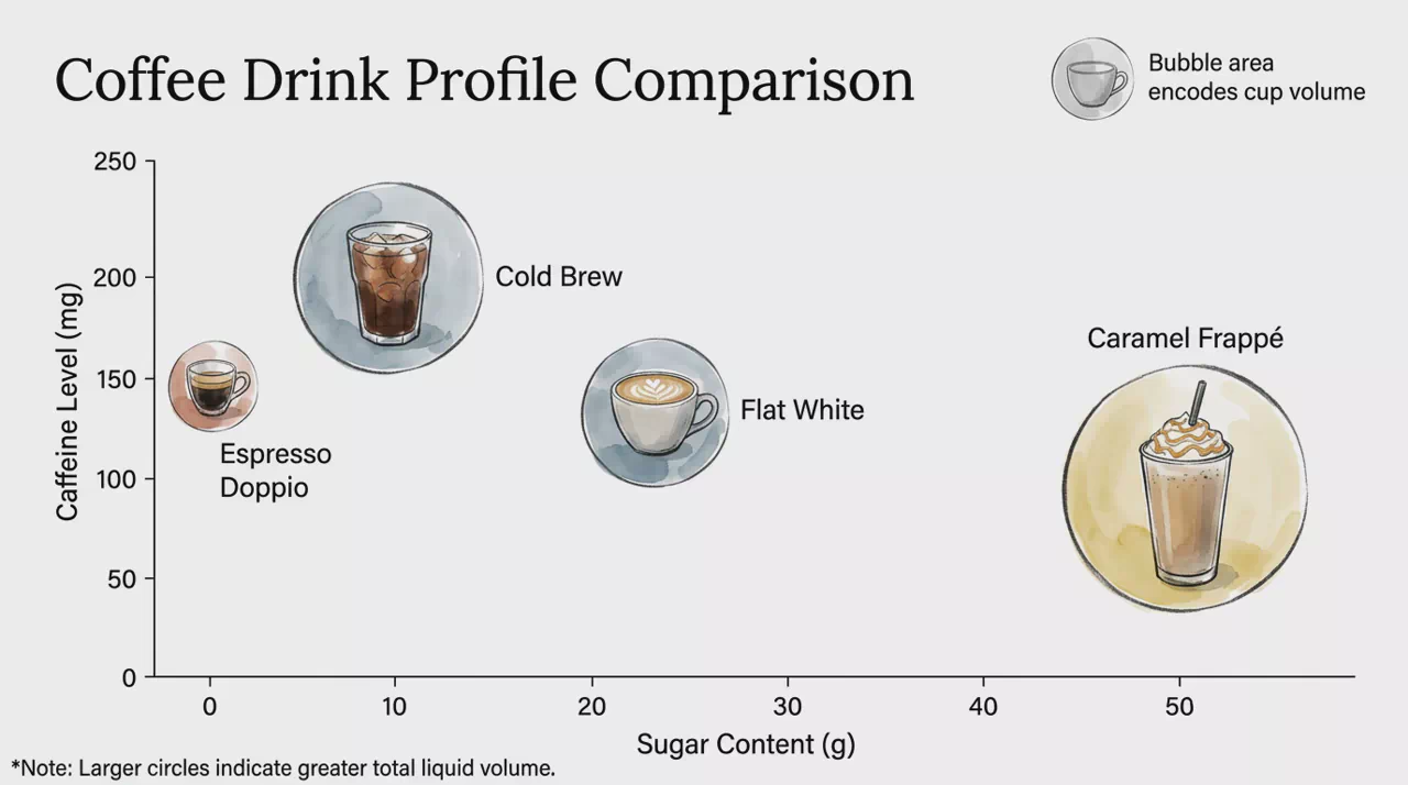
Bubble Matrix Chart
Scatter bubbles using position and size to encode three variables at once.
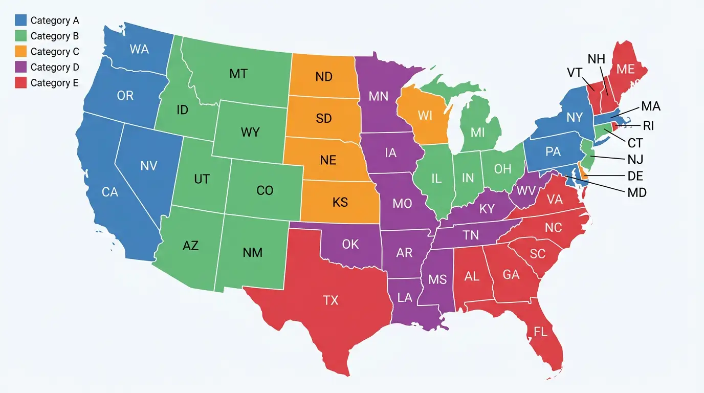
Choropleth Territory Map
Geographic map shaded by ownership, responsibility, or territory segments.
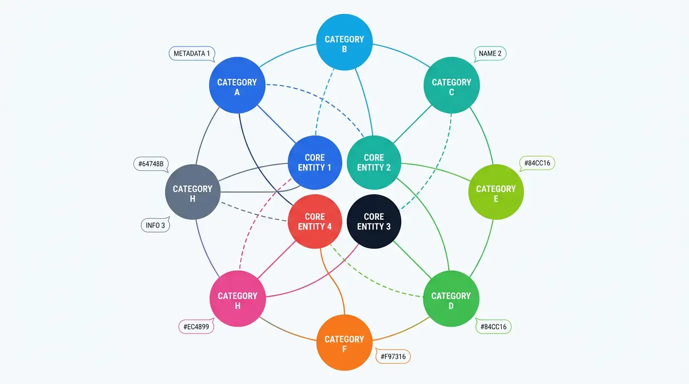
Radial Network Map
Central core linked to an outer ring of related categories or groups.
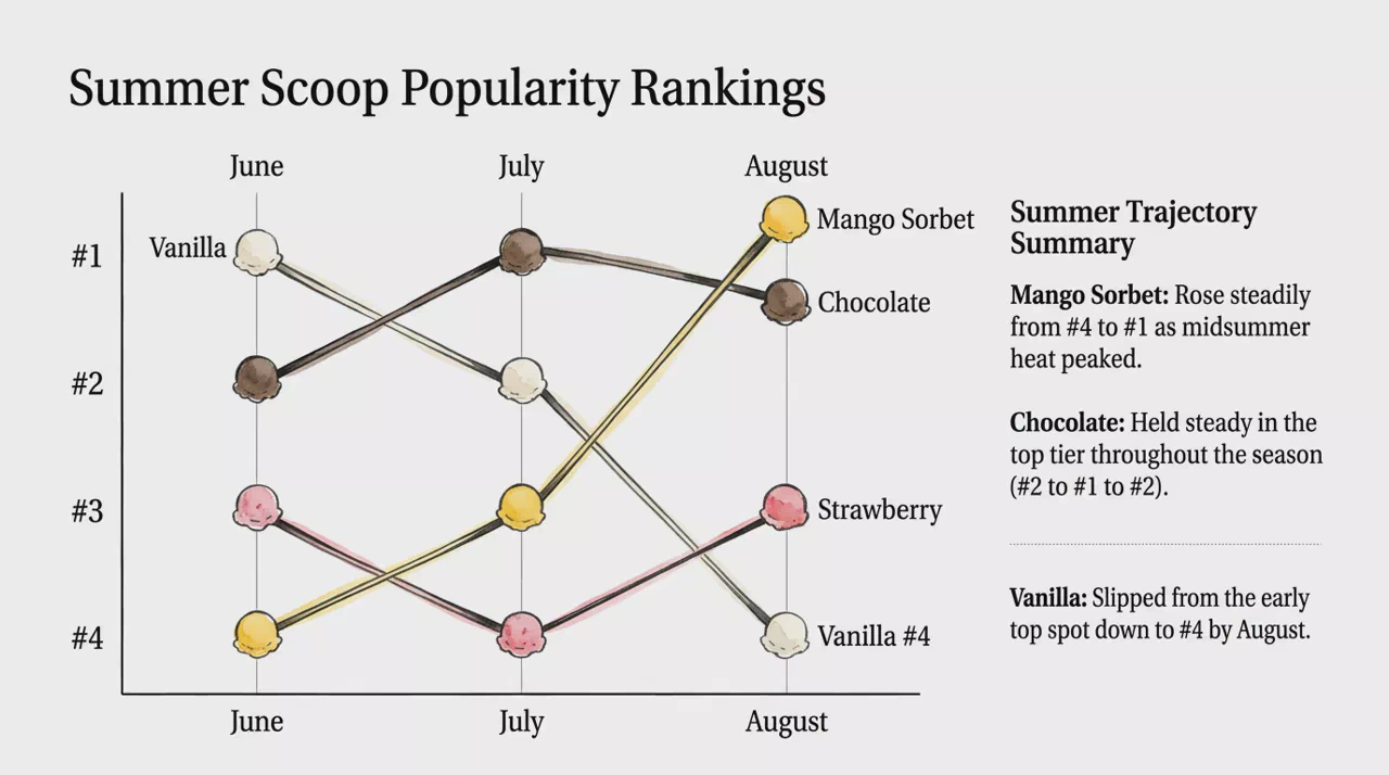
Bump Rank Line
Rank paths over time showing how entities rise or fall across intervals.
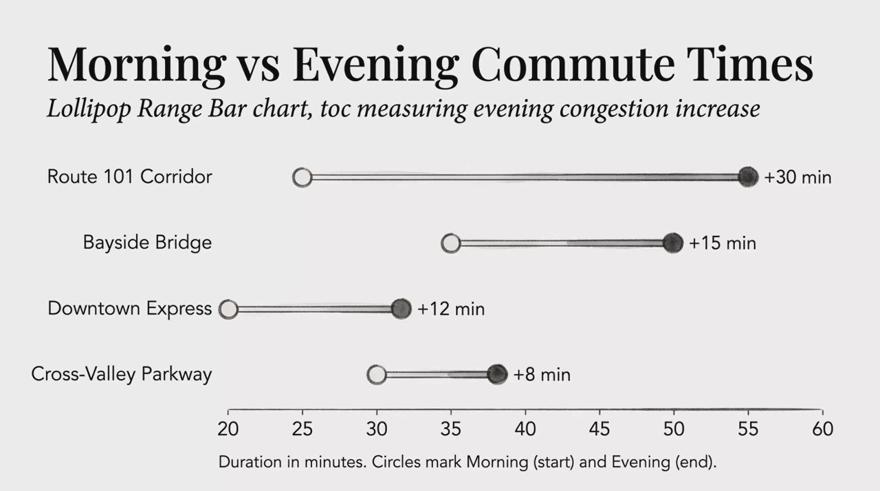
Lollipop Range Bar
Dumbbell lines comparing two values per category across a shared scale.
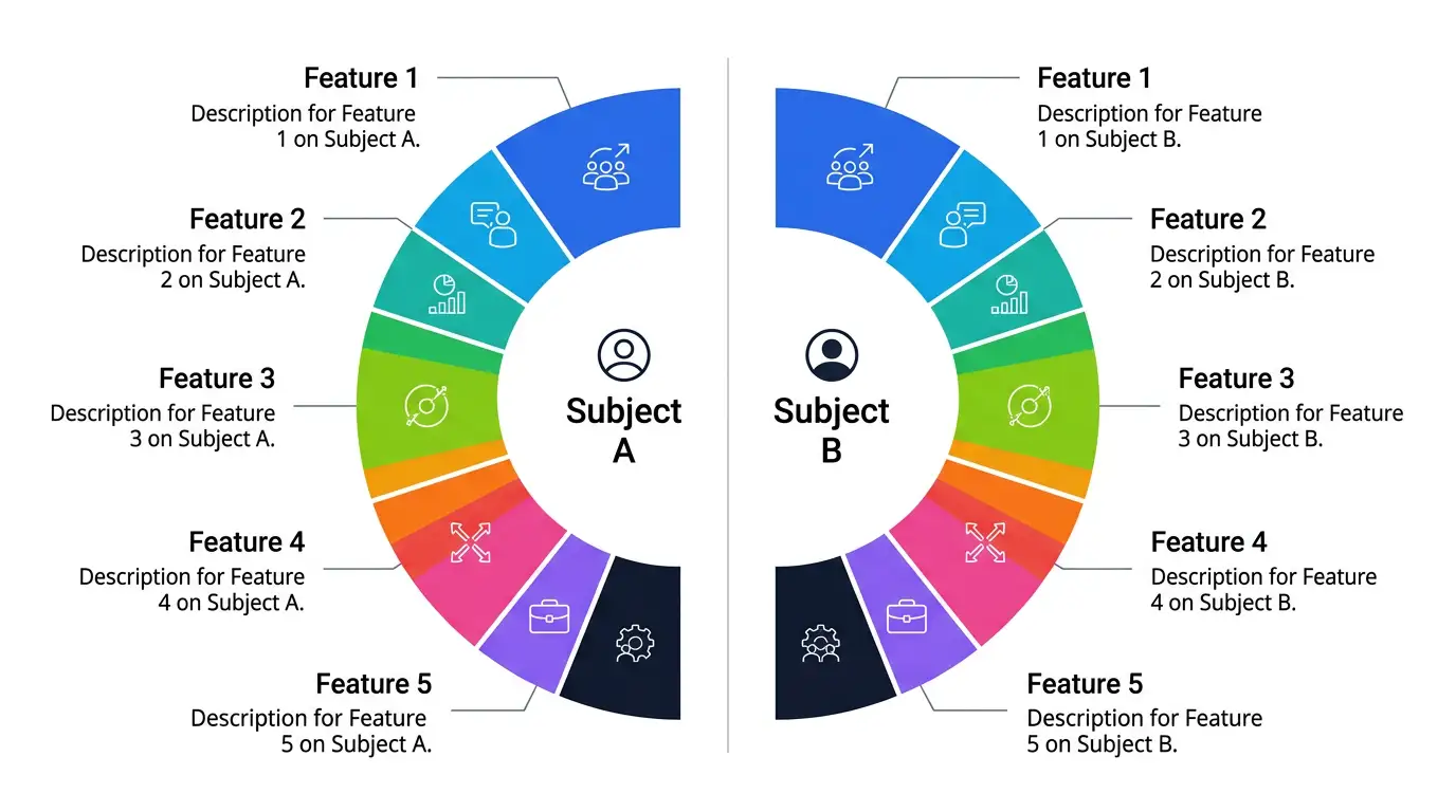
Symmetrical Comparison Circle
Mirrored semicircles comparing two subjects across the same criteria.
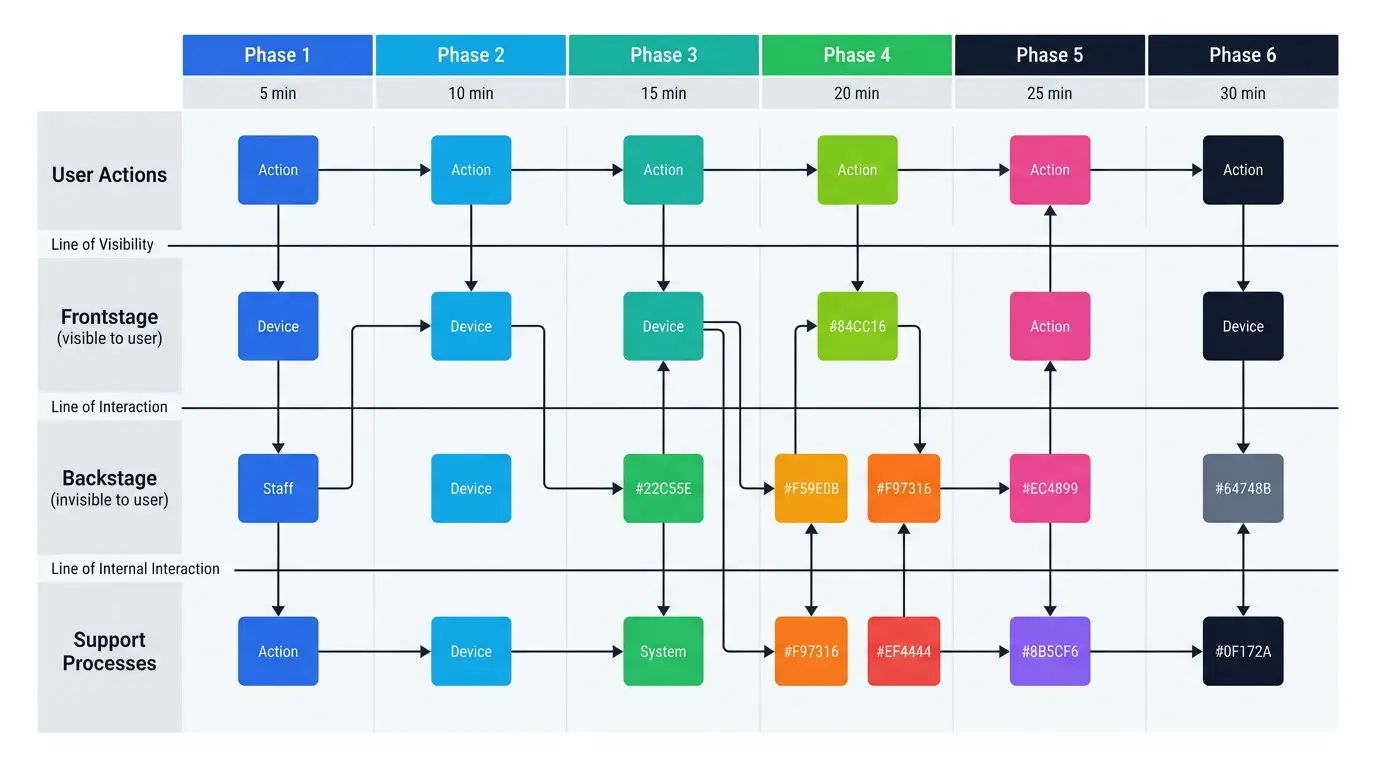
Service Blueprint Map
Multi-lane journey matrix linking user actions to frontstage and backstage work.
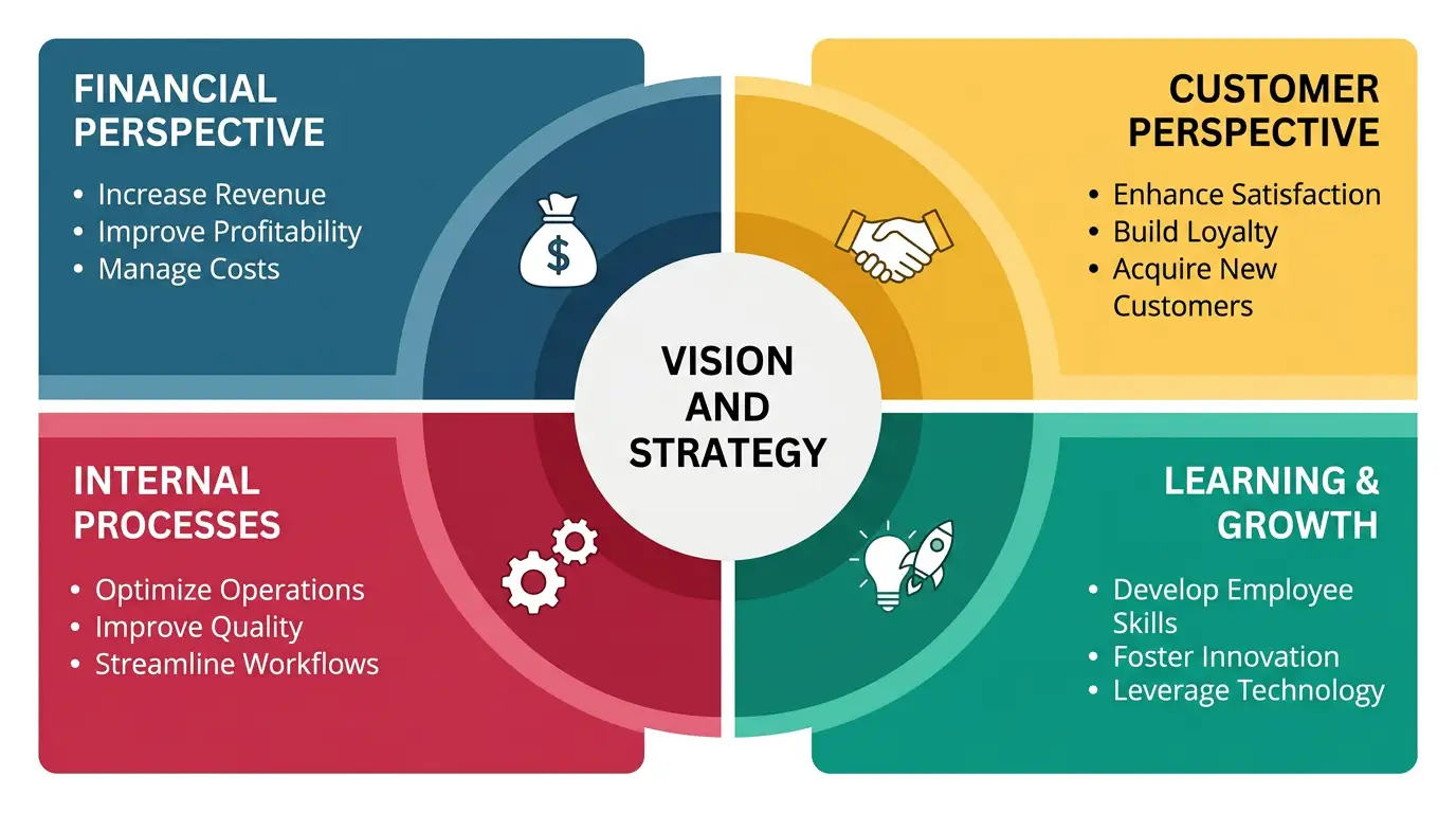
Balanced Scorecard Matrix
Central vision surrounded by four equal strategic perspective quadrants.
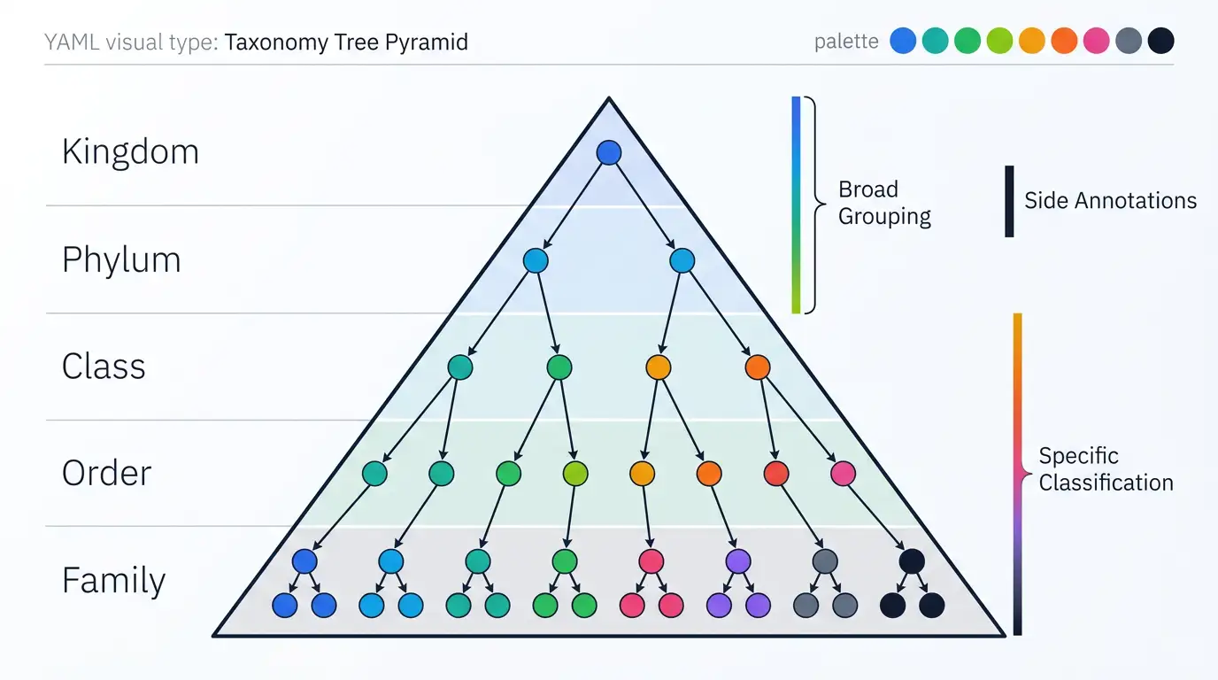
Taxonomy Tree Pyramid
Layered pyramid with branching tree showing progressive category subdivision.
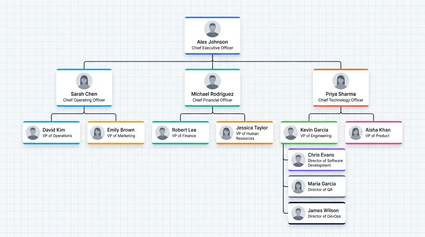
Hierarchical Org Tree
Top-down org tree showing reporting structure and chain of command.
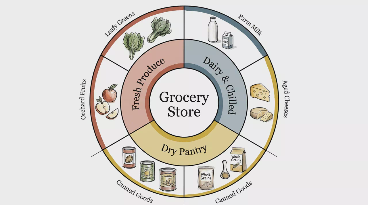
Sunburst Hierarchy Chart
Concentric rings showing hierarchical part-to-whole relationships.
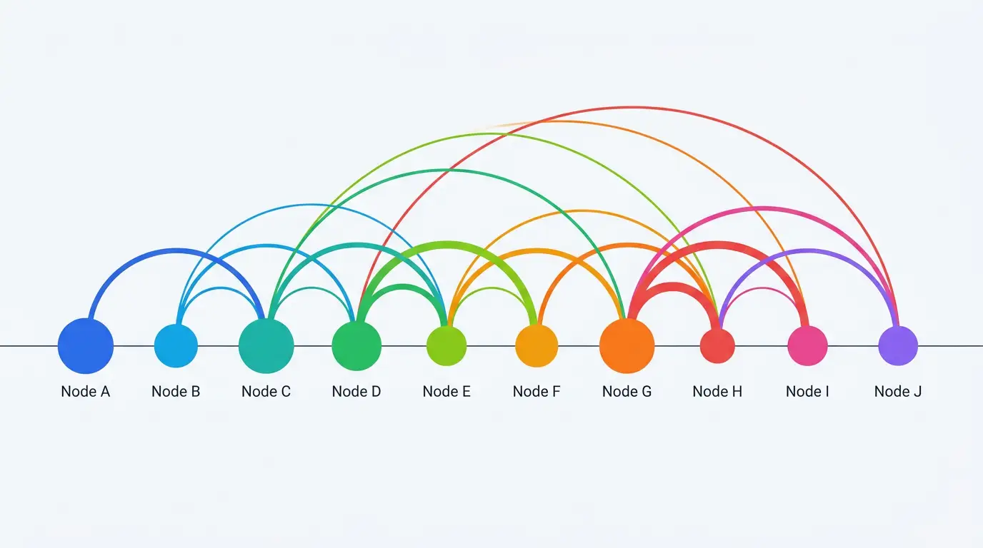
Arc Network Diagram
Nodes on a horizontal axis linked by arcs whose thickness shows relationship strength.
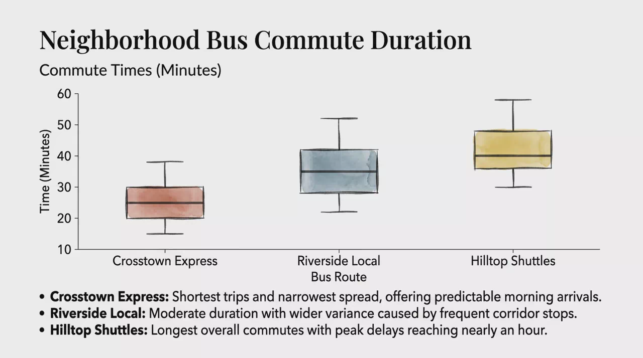
Box Plot Chart
Box-and-whisker chart showing median, quartiles, spread, and outliers by category.
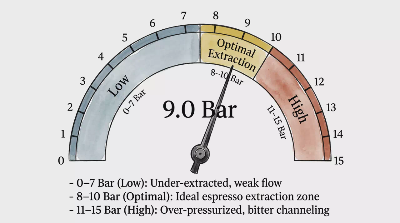
Radial Gauge Chart
Semi-circular dial with a needle showing one value against qualitative segments.
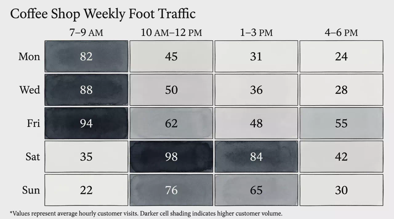
Matrix Heatmap
Color-intensity grid mapping numerical values across two categorical dimensions.
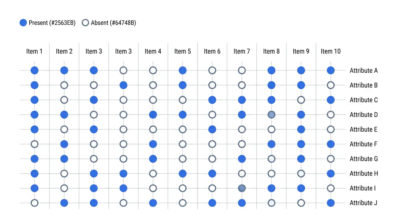
Attribute Matrix Table
Binary marker grid showing which items have which attributes.
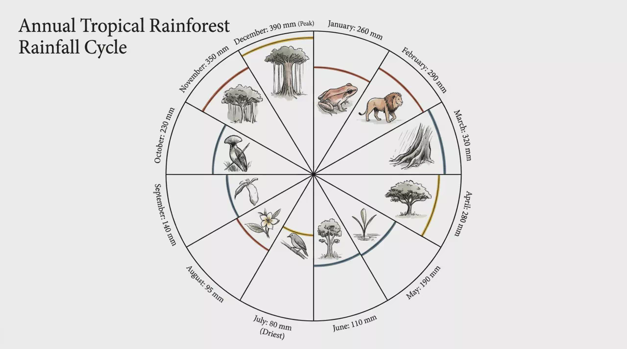
Nightingale Rose Chart
Polar petals of equal angle whose radius shows magnitude by category.
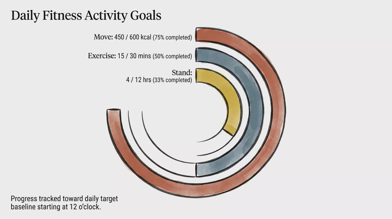
Radial Bar Chart
Concentric arcs from a shared baseline comparing category values in a circle.
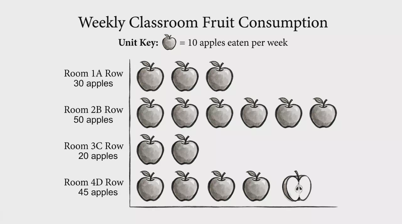
Pictorial Unit Bar
Repeated thematic icons representing quantities instead of abstract bars.
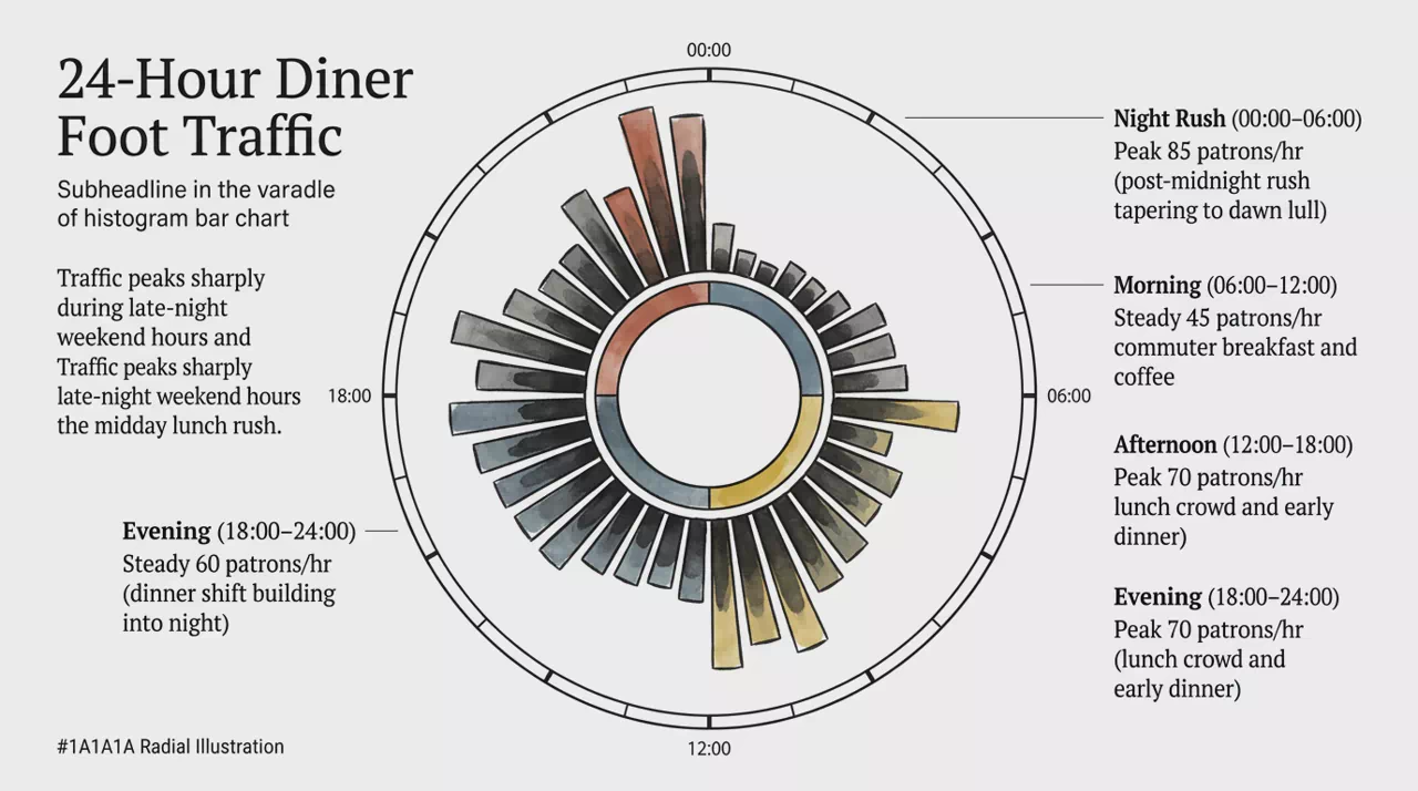
Radial Histogram Bar
Bars radiating from a center showing frequency across a cyclical scale.
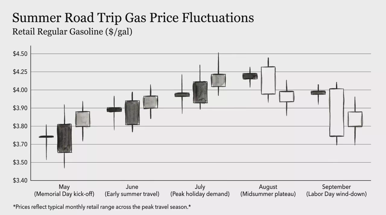
Candlestick Price Chart
OHLC candles showing open, high, low, and close with bullish or bearish bodies.
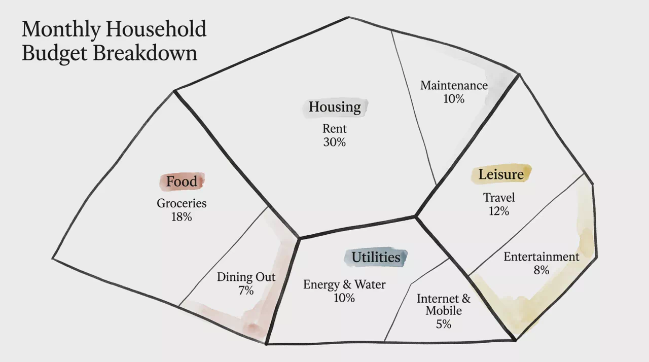
Voronoi Polygonal Treemap
Irregular polygonal cells whose area is proportional to hierarchical values.
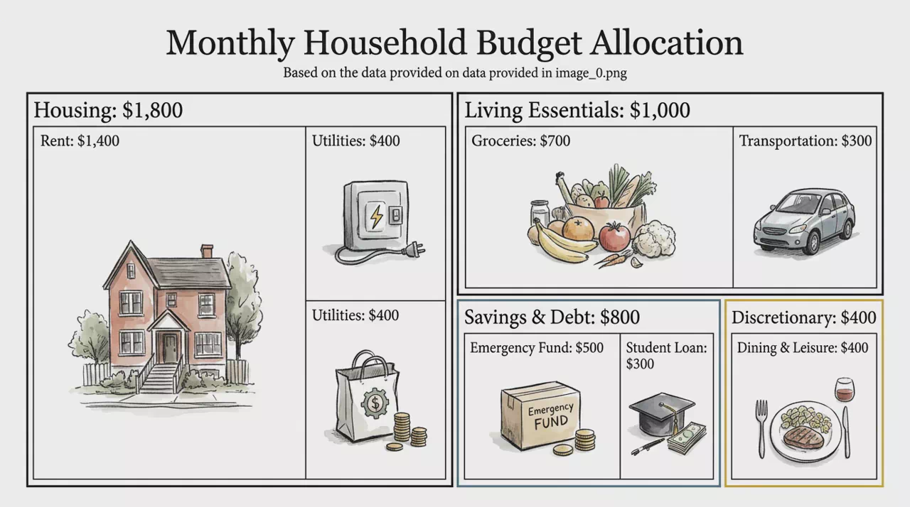
Hierarchical Treemap
Nested rectangles tiled so area shows part-to-whole hierarchy values.
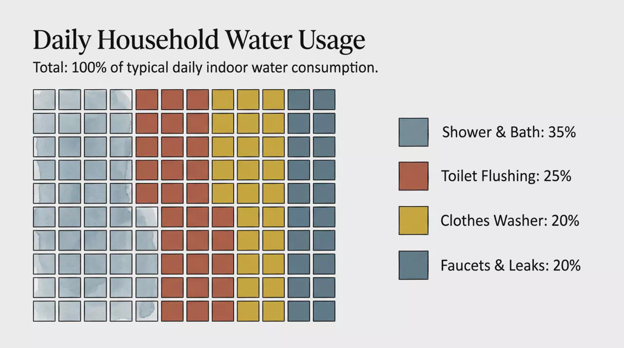
Waffle Grid Chart
10x10 square grid of 100 cells showing category proportions as filled blocks.
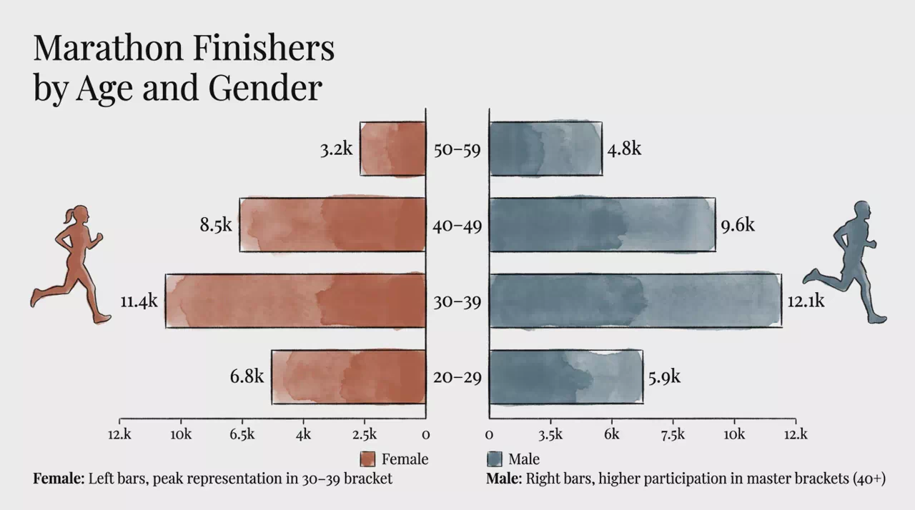
Population Pyramid Bar
Back-to-back horizontal bars comparing two subgroups across categories.
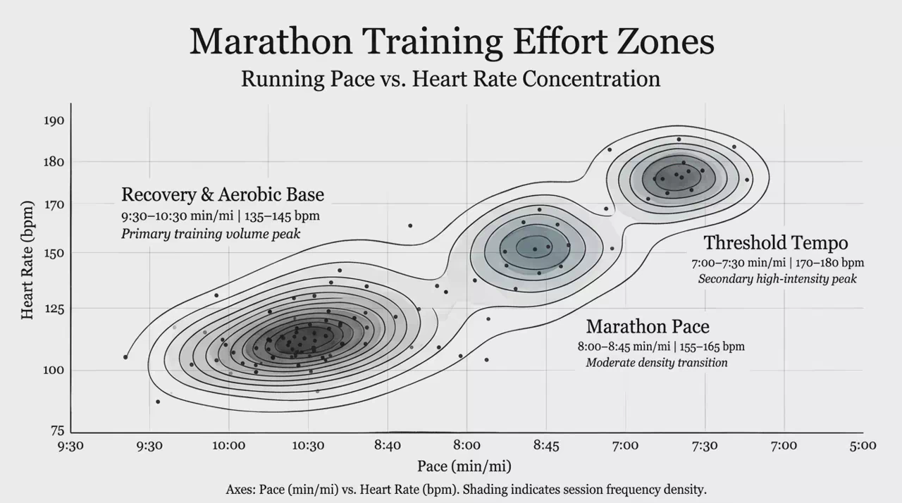
Density Contour Map
Scatter density shown with isolines and shaded peaks across two axes.
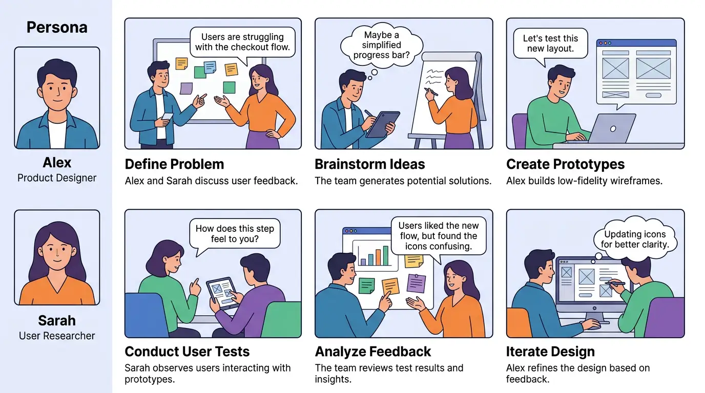
Sequential Storyboard Grid
Persona sidebar plus illustrated panels telling a step-by-step story.